
Dive into Data Visualization with a Pie Chart!
Are you ready to unlock the secret to creating a stunning pie chart in Word? Data visualization is a powerful tool that can help you communicate complex information in a clear and engaging way. And what better way to dive into the world of data visualization than by learning how to create a pie chart?
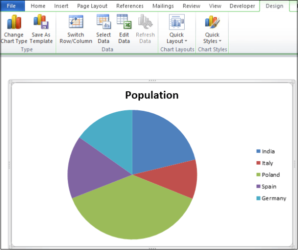
Image Source: javatpoint.com
Pie charts are perfect for showing the breakdown of a whole into its individual parts. Whether you’re analyzing sales data, survey results, or budget allocations, a pie chart can help you quickly and easily convey the key insights. Plus, they’re visually appealing and easy for your audience to understand at a glance.
So, let’s get started on our step-by-step guide to creating a pie chart in Word. First, open up a new document and navigate to the Insert tab. From there, click on Chart and select the Pie chart option. You’ll see a blank pie chart appear on your document, ready for you to customize.
Next, it’s time to input your data. Simply click on the Edit Data button on the chart, and a spreadsheet will pop up where you can enter your values. You can also label each slice of the pie by typing directly into the cells. Make sure to include clear and concise labels so that your audience can easily understand the information you’re presenting.
Once you’ve input your data, it’s time to customize your pie chart. You can change the colors of the slices, add a title, and even adjust the size and position of the chart within your document. Don’t be afraid to get creative and make your pie chart visually appealing – after all, the goal is to capture your audience’s attention and convey your message effectively.
As you’re customizing your pie chart, keep in mind the key principles of data visualization. Make sure your chart is easy to read and understand, with clear labels and a simple design. Avoid cluttering your chart with unnecessary elements, and focus on highlighting the most important information.
Once you’re happy with your pie chart, it’s time to share your masterpiece with the world. You can easily copy and paste your chart into presentations, reports, or emails, allowing you to communicate your data in a visually engaging way. And don’t forget to save your document so that you can easily access and update your pie chart in the future.
In conclusion, creating a pie chart in Word is a simple and effective way to visualize your data and communicate your message with clarity. By following this step-by-step guide, you can unlock the power of data visualization and unleash your creativity. So go ahead, dive into the world of pie charts and start charting your course to success!
Unleash Your Creativity: Make a Pie Chart Today!
Are you ready to unlock your creative potential and dive into the world of data visualization? Pie charts are a fantastic way to showcase your data in a visually appealing and easy-to-understand format. In this step-by-step guide, we will show you how to create a beautiful pie chart in Word that will impress your colleagues and friends. So, let’s get started and unleash your creativity!
The first step in creating a pie chart in Word is to gather your data. Whether you are analyzing sales figures, survey results, or any other type of data, make sure you have all the numbers you need to create an accurate representation. Once you have your data ready, open up Word and follow these simple steps to create your pie chart.
To begin, click on the Insert tab at the top of the Word document. From there, select the Chart option from the toolbar. A pop-up window will appear with various chart options to choose from. Scroll down until you find the Pie chart option and click on it to select.
Now, a blank pie chart will appear in your Word document. Next, click on the Edit Data button located at the top right corner of the chart. A spreadsheet will open where you can input your data. Simply type in your values and labels for each category, and watch as your pie chart automatically updates in real-time.
Once you have entered all your data, it’s time to customize your pie chart to make it stand out. Click on the chart to select it, then navigate to the Chart Tools tab at the top of the screen. Here, you can change the chart style, colors, labels, and more to suit your preferences.
For a more personalized touch, you can also add a title to your pie chart. Simply click on the chart title placeholder and type in a descriptive title that summarizes the data being presented. This will make your pie chart more engaging and easier to understand for your audience.
Another fun feature you can add to your pie chart is data labels. These labels can be added to each slice of the chart to show the exact percentage or value of each category. To add data labels, click on the chart and select the Data Labels option from the Chart Tools tab. Choose where you want the labels to appear, either inside or outside the slices, and customize the font and color to make them pop.
Once you are satisfied with the look of your pie chart, it’s time to finalize and save your creation. Click on the chart to select it, then right-click and choose the Save as Picture option. You can save your pie chart as a PNG or JPEG file to share with others or insert into presentations and reports.
Congratulations! You have successfully created a stunning pie chart in Word that is sure to impress. With just a few simple steps, you can unleash your creativity and transform your data into a visually appealing and informative chart. So, what are you waiting for? Start creating your own pie chart today and unlock the secret to effective data visualization.
Pie Chart Magic: Step-by-Step Word Tutorial
Are you ready to unlock the secret to creating a beautiful and informative pie chart in Word? Look no further! In this step-by-step tutorial, we will guide you through the process of creating a stunning pie chart that will impress your audience and help you visualize your data in a clear and concise way.
Step 1: Open Microsoft Word
The first step in creating a pie chart in Word is to open the Microsoft Word program on your computer. Once the program is open, create a new document or open an existing document where you would like to insert your pie chart.
Step 2: Insert a Pie Chart
To insert a pie chart in Word, navigate to the Insert tab on the top menu bar. Within the Insert tab, you will see an option for Chart. Click on the Chart option to open the chart gallery.
Step 3: Choose a Pie Chart
Within the chart gallery, you will see various types of charts that you can choose from. Look for the option labeled Pie and select it. This will insert a blank pie chart into your Word document.
Step 4: Enter Your Data
Now that you have inserted a pie chart into your Word document, it’s time to enter your data. Double-click on the chart to open the Chart Data window. Here, you can enter your data manually or copy and paste it from an Excel spreadsheet or another source.
Step 5: Customize Your Pie Chart
Once you have entered your data into the pie chart, it’s time to customize it to fit your needs. You can change the colors, labels, and design of the chart by right-clicking on different elements of the chart and selecting the Format option. Experiment with different styles until you find one that you like.
Step 6: Add a Title
To make your pie chart more informative, consider adding a title to it. Click on the chart to select it, then go to the Chart Tools tab at the top of the screen. Within the Chart Tools tab, you will find an option for Chart Title. Click on this option to add a title to your pie chart.
Step 7: Save and Share Your Pie Chart
Once you have customized your pie chart to your liking, don’t forget to save your Word document. You can also share your pie chart with others by exporting it as an image or PDF file. Simply go to the File tab and select the Save As option to save your document in the desired format.
Congratulations! You have now successfully created a stunning pie chart in Word. By following this step-by-step tutorial, you have unlocked the secret to visualizing your data in a clear and engaging way. Whether you are presenting data for work, school, or personal projects, pie charts are a powerful tool that can help you communicate your message effectively.
So what are you waiting for? Dive into the world of data visualization and unleash your creativity with pie charts in Word. Chart your course to success and impress your audience with your newfound charting skills. Happy charting!
Chart Your Course to Success with Word’s Pie Charts!
Are you ready to take your data visualization skills to the next level? Look no further than Word’s pie charts! These handy tools can help you present your data in a visually appealing and easy-to-understand way. Whether you’re a student working on a school project or a professional looking to impress your boss, pie charts are a fantastic option for showcasing your data.
So, how can you create a pie chart in Word? It’s easier than you think! Follow these simple steps to unlock the secret to pie chart success.
Step 1: Open Microsoft Word
The first step is to open Microsoft Word on your computer. If you don’t have Word installed, you can download it from the Microsoft website or use a similar word processing program that offers charting capabilities.
Step 2: Input Your Data
Next, input your data into a table in Word. Make sure to organize your data in a way that makes sense for a pie chart. For example, if you’re creating a chart to show the sales breakdown of different products, you’ll want to list the product names and their corresponding sales numbers.
Step 3: Select Your Data
Once you have inputted your data, it’s time to select the data that you want to include in your pie chart. Click and drag to highlight the cells that contain the data you want to use.
Step 4: Insert a Pie Chart
With your data selected, navigate to the Insert tab on the Word toolbar. Click on the Chart option, then select Pie from the list of chart types. A pie chart will automatically be generated based on the data you selected.
Step 5: Customize Your Chart
Now that you have a basic pie chart in Word, it’s time to customize it to fit your needs. You can change the colors, labels, and other formatting options to make your chart more visually appealing. Experiment with different styles until you find one that you love.
Step 6: Add a Title
To make your pie chart even more professional, consider adding a title. Click on the chart to select it, then go to the Chart Tools tab and click on Chart Title. Enter a title for your chart that clearly explains what the chart is showing.
Step 7: Save and Share Your Chart
Once you’re happy with your pie chart, it’s time to save and share it. You can save the chart as a separate file or insert it directly into your Word document. Share your chart with colleagues, classmates, or friends to impress them with your data visualization skills.
With these simple steps, you can chart your course to success with Word’s pie charts. Whether you’re a data visualization novice or an experienced pro, pie charts are a valuable tool for presenting your data in a clear and engaging way. So what are you waiting for? Dive into the world of pie charts and unlock the secret to creating stunning visualizations in Word.
how to create a pie chart in word


